Prospecta Geo
Institutional site for a geology, geophysics and environmental consultancy. WordPress + Bootstrap with an authorial visual identity, parallax and 4 accessible carousels.
If you ask me which project in my whole career I'm proudest of, it's this one. Not for my technical part — for the visual identity the designer at the time created for Prospecta, a geology, geophysics and environmental consultancy. I'm proud of other work of mine too, but some of it gets tiring to look at, or has such a strong design choice that it saturates over time. Prospecta I can spot with my eyes closed — and it never gets old.
Design there, frontend here
At K13 the split was simple: the designer prototyped (in Adobe XD back then, Figma wasn't the norm yet), I built. Architect and engineer — or, as I like to joke, architect and bricklayer. We worked together on so many projects, for so long, that he learned the Bootstrap grid on his own — the breakpoints we always used, the container sizes — so he could design in a way that never forced me into extra media queries or workarounds to fit his vision.
A project went through 3 or 4 rounds of client approval before it even reached the frontend. Then came the designer's review: he'd see the site running for real and compare it against what he'd drawn — "this should look like this," "I expected that" — and we'd either fix it or push back with a technical reason why not. In practice, though, while he was drawing and I was coding, we were already exchanging information constantly — so by the time it hit formal review, it was almost always already right. The final call, the hammer drop, always belonged to the client.
After enough projects together, it became instinct. I knew that if a 400-weight font was used in body copy, he'd want a 100-weight variant in a specific title. I knew where the secondary color would land, the order of the footer items — sometimes I'd code without even looking at the design again, because I already knew how he thought, and he already knew how I built.
Frontend on mocked data, WordPress underneath
On K13's WordPress sites, the frontend was built entirely on mocked data — we didn't wait for a working API to start styling. The backend team was responsible for wiring PHP and WordPress into our theme afterward. We had a basic boilerplate for structure (a Home with a Swiper, an About page, a Contact page with a form) and ready-made logic for blog listing/post, a sharing library, and a gallery (FancyBox), a slider (Swiper). But no project ever came out the same — every site picked up extra pages depending on scope, and the styling itself, the SCSS, was always built from scratch. We only reused Bootstrap's components and grid (accordion, etc.) — the JS logic existed already, the visual identity never did.
| Layer | Technology |
|---|---|
| CMS | WordPress |
| CSS framework | Bootstrap |
| JavaScript | jQuery, core-js |
| Carousel | Swiper.js |
| Gallery/lightbox | FancyBox |
| Image performance | LazySizes (lazy loading) |
| Chat | Jivosite |
| Analytics/Tags | Google Tag Manager |
| SEO | Yoast SEO |
An identity that never gets old
The whole site breathes Prospecta's earthy palette — terracotta as the action color, gold and sand as support, Work Sans typography, pill-shaped buttons that invert fill and border on hover. My part was reproducing that work with pixel fidelity — but the bigger pride is for a beauty that isn't mine. I just built in code what the designer imagined. A page-by-page tour shows where each decision lands better than any summary could.
Home
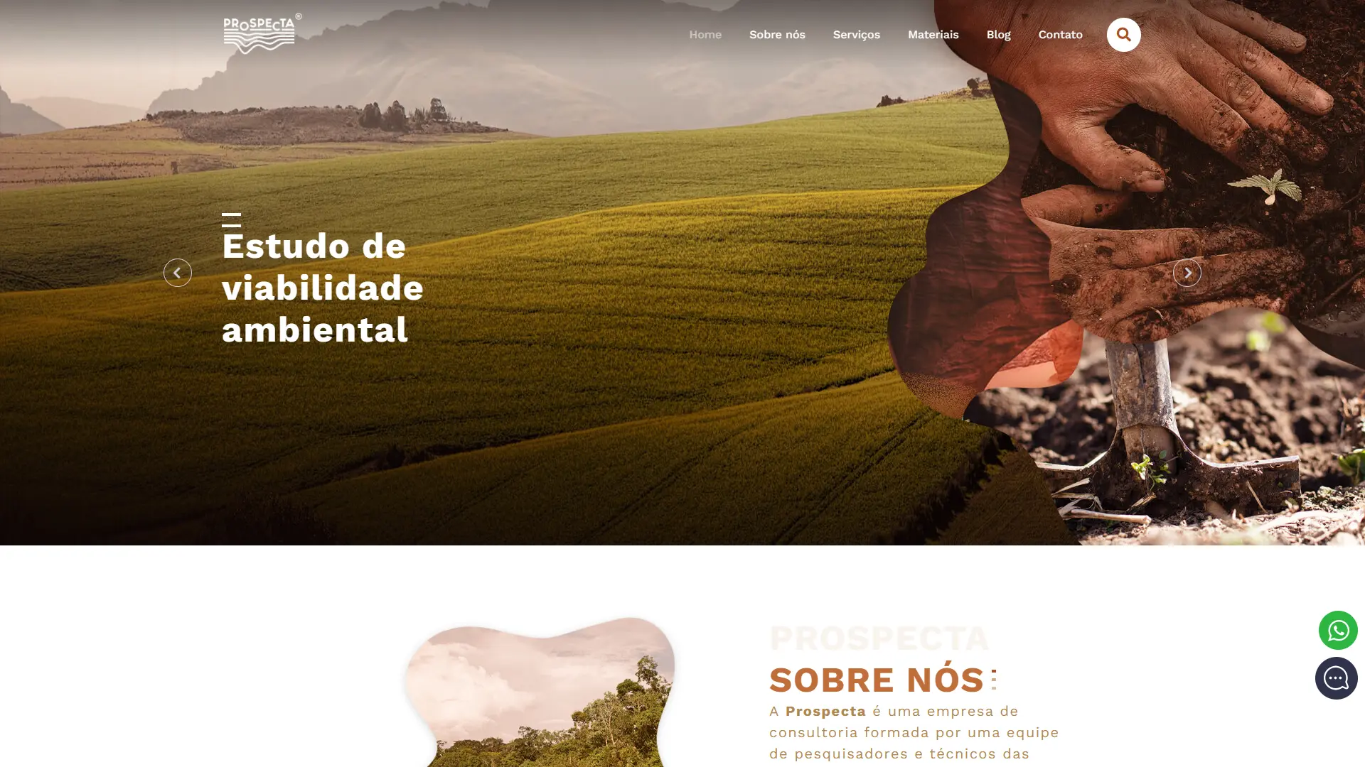
The hero is a Swiper carousel with 4+ slides — each one a <picture> with <source media> serving a dedicated mobile banner, not the same file resized by CSS. Below it, the service blocks (Geology, Geophysics, Environment) and the Artesian Well Studies highlight alternate in a zigzag layout (order-1 order-md-2), with loose decorative shapes behind the text to create a sense of composition instead of a generic grid.
About
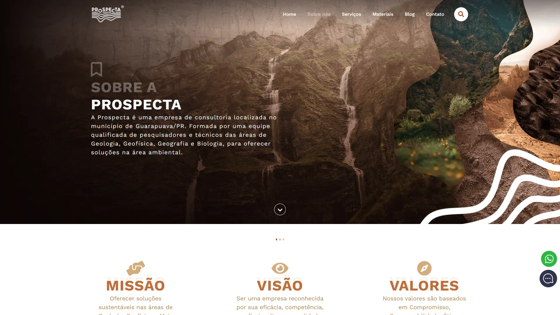
This is the page where the visual identity shows the most. The "Our Structure" section uses real parallax (background-attachment: fixed, with a scroll fallback on mobile — dodging the classic fixed-parallax bug on iOS) over a Swiper gallery of 7 real field and drone photos, each slide a <button> that opens a lightbox. Right below, the "Contributors" carousel introduces the technical team with photo, name, role, and a short bio.
Services
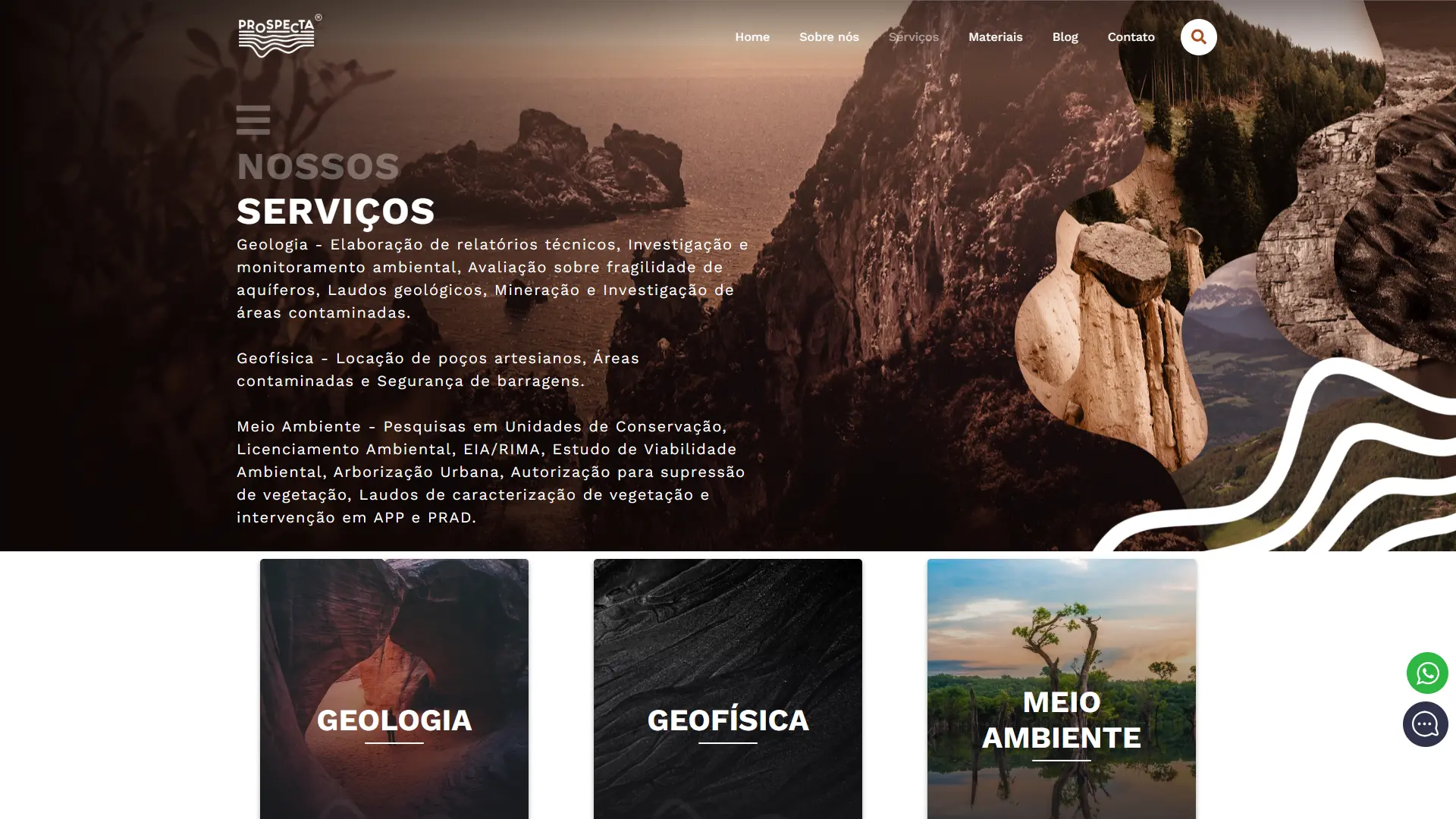
Three category cards lead to 11 individual service pages — each with its own hero carousel and a gallery of real field photos for that specific type of work, not generic text reused across pages.
Materials
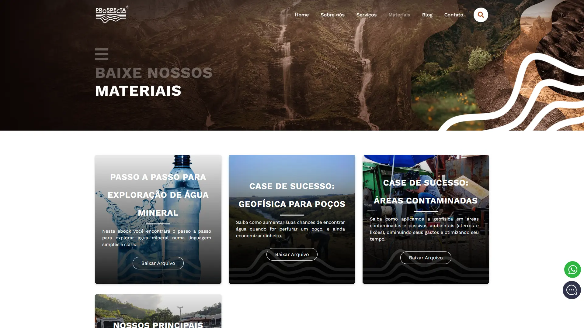
Ebooks and success-case PDFs, downloaded directly — no email-capture form in the way. A conscious decision to prioritize delivering content over aggressive lead capture.
Blog
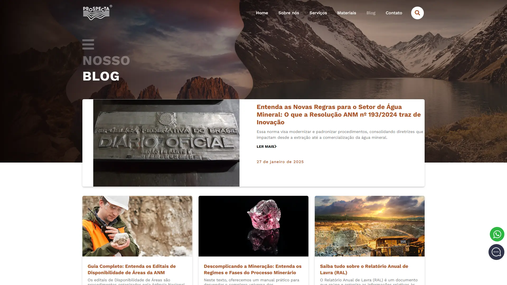
The listing is lean — a card with title, excerpt, spelled-out date, and numbered pagination, no category sidebar or search. The posts themselves are technical/regulatory content about mining (ANM, environmental licensing, mineral water), all signed by the same person on the technical team — detailing each one isn't the point of this case, but the post template follows the same visual system as the rest of the site.
Contact
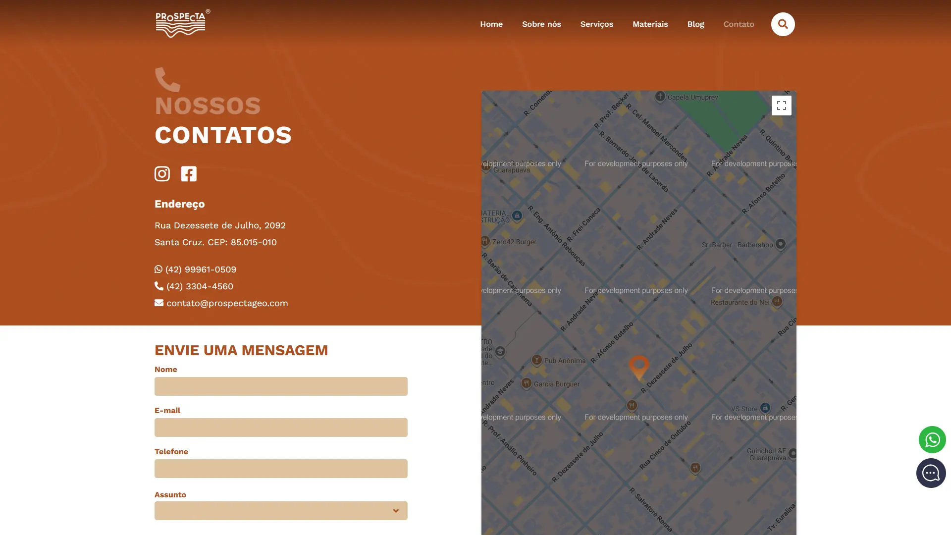
A simple form (name, email, phone, subject, message), the same parallax banner reused from the About page, and — instead of an embedded map — direct links to Waze with each address's coordinates. Chat widget via Jivosite, with a direct shortcut to WhatsApp Business.
Across the site's four carousels (main banner, each service hero, field gallery, team), every single one gets its own accessibility label — the kind of detail only someone who actually cares about keyboard and screen-reader users bothers with, not just the people scrolling with a mouse.
Thank you
This project wouldn't have happened without K13 — the methods, the constraints, the goals that taught me how to work like this. I'm deeply grateful to Robson Krieger, K13's owner at the time, and to every colleague from that era who made working there so much fun.